Wealthsimple has done a good job of growing to one of Canada’s major FinTech companies. After less than a year, the company managed to raise a $30 million round, and can often be found partnering with fellow Toronto FinTech startups with the goal of improving financial services for Canadians.
Of course, as companies move on to the next phase of growth, so too do their platforms. The company rebranded in November in a move to communicate with their target demographic — young millennials — in a more “authentic” way, an area that most brands struggle.
“Brand is the opportunity for companies to compete. We wanted to remind people why they’re investing in the first place. The way people talk about robo-advisors, it gets caught up in the technology and software part of it,” CEO Mike Katchen told BetaKit at the time.
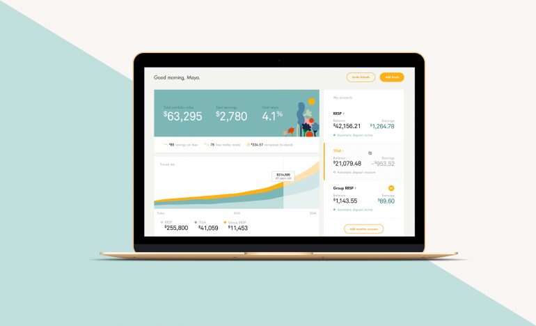
This week, Wealthsimple has made another change to relate to their users in a big way. The company rolled out a redesigned platform, featuring an overhauled dashboard for users that manage multiple accounts and features that help users better quantify how their financial planning can help them reach their goals.
On top of being able to see balances of all accounts, users can also look at Wealthsimple’s Future You projection graph, which predicts the growth of accounts until retirement.

“The trick with finance is that you don’t want to confuse or bore people. If you go too smart, people get bored, and if you go too simple people don’t trust you. So we’re looking for that intersection,” said Rudy Adler, Wealthsimple’s new chief product officer. “In everything we do, we want it to look good but a lot of this is based on real functionality and tools that we can build to make our clients more informed about their financial picture. We’re in the software business so we are constantly looking for ways to innovate. This release is all about tools and projections.”
After many requests from customers, Wealthsimple aimed to make the platform more visual and intuitive with the addition of graphs that allow users to track performance across several time periods. Users can also learn about how certain deposits will affect the growth of accounts before they commit to them.
“People asked us all the time, ‘how do I know if I’m on track or not?’ That was genesis of that feature. With a lot of the features we did a lot of customer interviews and we made a list of everything that people wanted, and what we wanted to do,” Adler said.
“Instead of going feature by feature, we wanted to roll out 40 features in one release,” said Adler. “What we released today is considered version one, and there’s still a lot more we haven’t released that will be out soon. We wanted to address the low hanging fruit, and most things that got prioritized were things we heard a lot from a lot of different customers.”
Beyond just providing tech tools, the company is also hoping to drive more traffic to their Grow digital magazine, which the company calls its guidebook for educating users about investments. Their magazine, once relegated to a blog, is being moved onto the front page on its learn page. Grow includes Money Diaries series, which have featured guests like Spike Lee in the past, and How To’s on life goals like starting an art collection or buying an engagement ring.
“We’re trying to make finance less scary. People are scared of doing the wrong thing, and it’s kind of confusing,” said Adler about the philosophy behind Wealthsimple’s rebrand. “We take this mindset into account. How do we make it less scary, and how do we use language that isn’t too ‘finance-y’ that people can’t comprehend it.”
Disclosure: Wealthsimple is BetaKit’s FinTech sponsor and the reason we deliver the FinTech Times hot and fresh every week.


