Rebrands are not often the purview of small startups, left usually to larger institutions trying to shed the impression of being out of touch after generations of business. When a startup does rebrand, it’s often part of a pivot, getting away from an old idea in favour of the new one that will drive revenue and traction.
Wealthsimple, which unveiled today its rebrand with the fanfare typically reserved for new product launches, fits neither of those categories. One of Canada’s fastest growing FinTech companies, it’s also one of the youngest, taking less than a year to raise a $30 million Series A round from financial giant Power Financial Corp.
BetaKit spoke with Michael Katchen, CEO of Wealthsimple, about the company’s new brand and what it aims to accomplish.
What prompted the decision to rebrand?
We’re the largest automated investment platform in Canada, and we’re growing fast. We’re going head to head against the biggest brands in the financial industry in Canada and in the world. We think their brands are cold, they’re stale, and they don’t speak to our demographic in an authentic way. So we decided to rebuild our brand from scratch and speak to our clients: young millennial investors.
We see so many companies spending so much time focused on building the best product, and yes, you have to do all these things. But at the end of the day, if people don’t hear about you, trust your brand, or support you, you will never break out of being seen as just another startup company.
Your new brand echoes Instagram, Airbnb. Is investing and finance a lifestyle category now?
Brand is the opportunity for companies to compete. We were inspired by the Airbnb rebrand, and how they swiped their blue bubble logo and look for a look and tone that was more human and relevant.
We wanted to remind people why they’re investing in the first place. The way people talk about robo-advisors, it gets caught up in the technology and software part of it. But most people don’t even think about that – they just want to have a better life and a bit more money to do what they want to do.

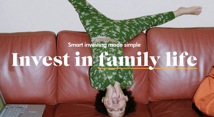
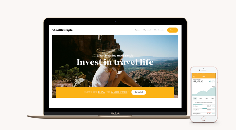
Tell us how that factors into your new landing page, with photos of kids doing cartwheels, or beach and cottage life.
We noticed that most banks don’t really have people in their photos, and even when they do, most banks use this obvious stock photography. So we decided to use real photos people we know took – our friends took – and they’re not posed. It feels fresh and relevant.
“We didn’t want to be the startup company that looks like every other tech startup out there.”
The way we view our brand is a Venn diagram of smart and simple, so by creating this brand that talks in real language, we really are trying to help our clients become smarter investors. There will be really thoughtful and smart content, and we want it to be relevant and interesting for people.
Rather than showing you the retirement calculator and the income of X, we want to talk about your goals. What do you want? Is it going on vacation? Is it buying a cottage? Because honestly, that’s my financial goal, too. I want to be able to afford a cottage one day.
I would have no reason to believe that people would trust us less with this brand – our first brand looked like a tech startup. It dials up the risk factor somewhat, because it’s colourful and uses real language. We didn’t want to be the startup company that looks like every other tech startup out there.
So you’re basically hacking growth with this rebrand?
Assuming you have your product and team and operations right, we believe you can win on brand. Sometimes, in the startup community, we get hyper focused on paid acquisition and what channels are working. But brand is very important part of organic and paid acquisition – and every channel is amplified by brand. For startups in early stages, it was typically about finding a domain name that was available, a logo from 99designs, and a tagline you’d DIY. Now, we recognise that a brand really can be a force-multiplier.
Did you hire an agency to lead your rebrand? How did you manage this?
Our head of brand, Rudy Adler, who I worked with at our YC company a few years back called 1000memories – we ended up selling to ancestry.org – helped redesign everything for us. Rudy comes from an advertising agency called Wieden+Kennedy, widely known as Nike’s ad agency, and worked on big branding campaigns for Levi’s, Apple, Target, and other big consumer brands. He works full-time with Wealthsimple now, and he will ensure our brand permeates through the content we create, our campaigns, and everything we do.
For example, we will have a series of interviews with people, and no, we are not talking about retirement when you’re 65. We went out and spoke to real people about their relationship with money, like Elizabeth Gilbert, the author of Eat Pray Love, or a celebrity hair stylist who did Helen Hunt’s hair the day she won the Oscars, and how he was so broke he couldn’t even watch the ceremony from home. Wealthsimple is about personal growth, as much as it is about product growth. We’re talking to the people who have more than money on their minds.

How do you think people will react to this new approach to branding in finance?
In our business in particular, we sell trust. Finding ways to convey trust and authenticity was always important to us. Once we got Rudy onboard, we have been hugely influenced with his perspective on brand – and if you think colours, font and logo are all a brand is, you’re missing out. It’s understanding who your clients are and what they care about, and then figuring out how to talk to them. We spent tremendous time talking to our clients about what matters to them before making this change.
We wanted to bring a human face to investing. We looked at a lot of different financial brands, and we really wanted to get away from some of the traps we found ourselves falling into. 90 percent of them use a combination of blue and green, but we’re trying to go towards warmth, energy, and human feel. We spent a lot of time playing with colour, and decided to go with blue, yellow, and red, updated to be more contemporary.
We did a survey about how financial services tends to do photography, and none of that felt authentic. Where our business is going is a younger generation of investors, and they can tell pretty quickly if the brand is authentic or not. That’s one of the reasons we used photography from our friends, where we know nothing was staged, and it doesn’t look perfectly composed.
What does the new Wealthsimple brand mean to you? Will it be part of the overall growth strategy?
It’s about how you should have fun and take risks in you life, experiences, and activities. You don’t need to take risks with your investments. We want people to realize that our product is even safer than a lot of the products big banks are selling. But above all, we want people to enjoy and celebrate their life. We didn’t partner with an agency for a three-month project and now it’s over. We’re making this commitment to brand a core part of our strategy with words and actions, and it will continue to develop.
Do you think Canadian startups need to spend more time thinking about their brand as they build their company and product?
Brand doesn’t replace great product and client experience. Those are table stakes. Once you have those right, a brand can help accelerate growth, multiplying the impact of all other marketing channels. Ignoring brand might not be a particularly Canadian startup issue, but a startup issue everywhere.

