
Taking care of your health can be an emotional and stressful experience—you feel nervous about telling your doctor the truth about your weekly donut binge you feel excited that you’ll finally get to see an ultrasound of your growing baby, you feel scared about how your prognosis will affect your loved ones.
Interacting with healthcare is just as much an emotional experience as it is a practical one, so why is it that many of the healthcare services we depend on are designed to feel so impersonal? Our world is filled with colour, nuance, and emotion, yet clinics are plagued with empty white walls, grey chairs, and beige curtains, mostly in the name of efficiency and cleanliness. Naturally, the technology adopted in these environments follow the same principles. If you’ve ever seen an electronic medical record (EMR) you know what I’m talking about.
Healthcare is not successful in a silo: it must fit into people’s everyday life, and everyday life is, to an extent, coloured by our health.
As a designer, I understand how these decisions are made. The healthcare experience is unique to every person and to every situation, so in an effort to serve everyone, we play it safe. We remove all emotion in the way we design the places, spaces, and things that we encounter when dealing with these extremely sensitive and contextual moments. The thought is that if we don’t impose a strong point of view, no one will be alienated.
The problem with this is that it doesn’t address an individual’s full experience. It ignores the emotional connection we have with our own health. Though the goal of these decisions may be to make technology appear neutral and universal, it can feel cold and indifferent in a vulnerable moment.
In tech, we love to talk about disruptive solutions. We love to shout “human-centred design” from the rooftops. We have added a layer of humanity to the way we design food delivery, messaging, and ride-sharing apps. We have established consensus that these everyday experiences should be delightful and we consider how a person will feel when interacting with these systems. But, somehow, even though we all interact with the healthcare system at some point, design has left these systems behind. Those designing healthtech solutions think they can be disruptive with the technology while playing within the visual norms of this industry. We disagree.
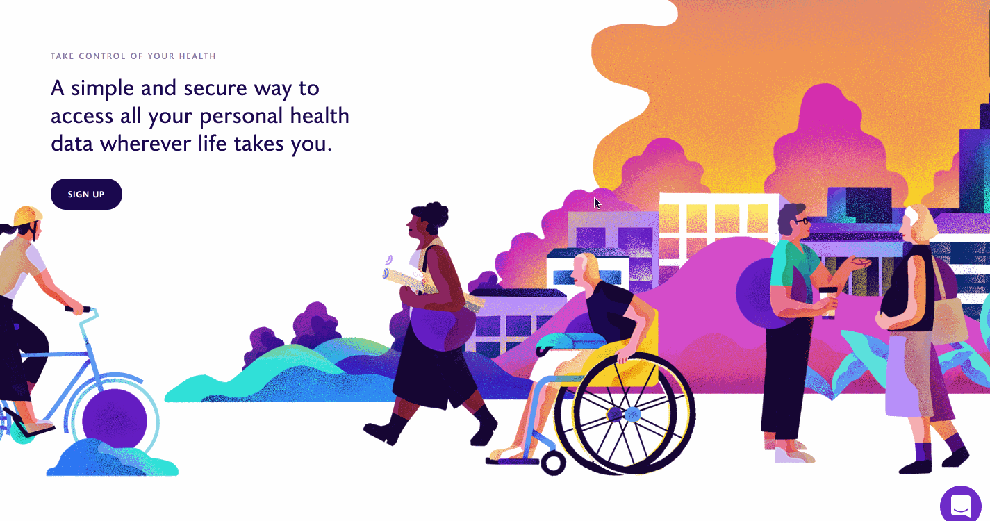
Illustration also became a big part of bringing warmth and humanity into our communication. Healthcare can be deeply intertwined with every other part of your life.
At Dot Health we believe that access to a holistic picture of your health is fundamental to being an active participant in your healthcare. When we were figuring out who we wanted to be as a company, we realized that on every front we wanted to address the full dimension of the human healthcare experience. It’s not enough to just give people easy access to their health records. We need to help them understand what this information means to them, and acknowledge the emotion and vulnerability that can come with it. Healthcare is not successful in a silo: it must fit into people’s everyday life, and everyday life is, to an extent, coloured by our health.
How we look and the way we communicate with our users is the first step to exploring what it means to design experiences that make healthcare more open, approachable, and human. We wanted to do away with the visuals that are often associated with healthcare: muted blues and reds, straight lines, and clinical illustrations. Instead, we adopted a colour palette that has a stronger point of view. A point of view that is bright and optimistic about what having access to your health data can do to improve your health and your life.

We wanted to visually represent that an individual’s relationship with their health changes over time and circumstance. It’s a fluid experience. To do this, we replaced hard, straight lines with soft curves. Design decisions like these seem small but it’s crucial that we be intentional in making them.

Illustration also became a big part of bringing warmth and humanity into our communication. Healthcare can be deeply intertwined with every other part of your life. Whenever I tell people what we are trying to do, they always have a story to share about how healthcare has affected their life. So, we worked to develop a style that focused on story, depicting snapshots of individuals going about their day with the Dot Health purple dot simply going along for the ride. We leveraged our colour palette to make them feel bright, inviting, and warm with a focus on human interaction. With the individual at the forefront, we also strived to showcase a diverse set of people, using the uniqueness of healthcare experiences as an asset, not a hindrance, to inclusivity.
I see our responsibility as designers to engender curiosity in a way that encourages discovery and growth. We can only do this if we are relentless in our pursuit to build things that not only reflect our humanity, but also push it to be better for everyone. This is just the beginning of that for Dot Health. We are still working through how we bring life back into healthcare with everything that we do. It’s a long, complex journey full of difficult decisions but I believe that if we are thoughtful, deliberate, and above all, courageous, we can collectively design a future for healthcare that is a bit more like all of us: human.
Feature photo via Burst.