BetaKit - Canadian Startup News & Tech Innovation
Canadian Tech & Startup News
  • About
  • Advertise
  • Members
  • Contact
BetaKit - Canadian Tech & Startup News
Canadian Tech & Startup News
  • News
    • Latest News
    • By Topics
      • Funding
      • Acquisitions
      • Layoffs
      • VC
      • Events
      • Markets
      • Reports
      • Impact
    • By Verticals
      • AI
      • FinTech
      • SaaS
      • Retail
      • Healthtech
      • Cleantech
      • Deep Tech
      • Defence Tech
    • By Regions
      • Toronto
      • MontrĂ©al
      • Vancouver
      • Waterloo Region
      • Ottawa
      • Calgary
      • Prairies
      • Atlantic Canada
  • Podcast
  • Newsletter
  • Quiz
  • Jobs

Hootsuite Rebrands Logo with Darker, More Sophisticated Look

By Joseph Czikk June 4, 2014
Email Share on LinkedIn Share on X Share on Reddit Share on BlueSky

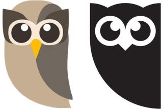
Vancouver-based social media dashboard startup Hootsuite has changed its long-known “Owly” logo in a rebranding effort. 

The startup has been in business for six years now, achieving some serious highs, including raising the largest round of venture funding in Canadian history last year. Now the company apparently wants to appeal to executives in a more mature way, according to AdAge.

Owly, the brand’s longtimemascot and logo, has gone black and white from a multi-tinted grey. 

hootsuite

The official unveiling will happen on Wednesday at Connect in London at a HootSuite customer and user event.

“How people use us has become more sophisticated and we wanted to reflect that maturity, as a brand and company. We also serve such a range of companies from bloggers to small- to midsized businesses to large enterprises that all want analytics, security, compliance and we want to have a brand that reflects those full range of needs,” HootSuite’s VP of marketing Dee Anna McPherson told AdAge.

B.C.-based branding agency Vigilantes handled the account.

“We wanted the image to be more grown up without losing any brand equity,” said Vigilantes’ Arndt Klos. “We didn’t want it to be overly corporate. It wasn’t a traditional logo mark, it was more of a mascot. We wanted to be able to dial up level of maturity no matter what audience we were speaking to.”

branding dashboard hootsuite logo rebrand social media startup Vancouver
Email Share on LinkedIn Share on X Share on Reddit Share on BlueSky
0 replies on “Hootsuite Rebrands Logo with Darker, More Sophisticated Look”

Latest Posts

People talking around a table
Christopher Skeete exits QuĂ©bec’s innovation portfolio in cabinet shuffle
Madison McLauchlan September 12, 2025
Prime Minister Mark Carney speaking to press September 11, 2025.
Carney says new Major Projects Office will help build a “Canadian sovereign cloud”
Alex Riehl September 11, 2025
Elevate Main Stage
AI, startups, and Simu Liu: Elevate Festival announces 2025 schedule
Alex Riehl September 11, 2025
BetaKit Most Ambitious 2025:
Telling the story of what's possible.
BetaKit Logo

The publication of record for Canadian tech and startup news since 2012. Learn more

  • Advertise With Us
  • Privacy Policy
  • Become a Member
  • Terms of Use
  • Get In Touch
© 2012-2025 BetaKit Incorporated. All Rights Reserved.
Back to top
  • News
    • Latest News
    • By Topics
      • Funding
      • Acquisitions
      • Layoffs
      • VC
      • Events
      • Markets
      • Reports
      • Impact
    • By Verticals
      • AI
      • FinTech
      • SaaS
      • Retail
      • Healthtech
      • Cleantech
      • Deep Tech
      • Defence Tech
    • By Regions
      • Toronto
      • MontrĂ©al
      • Vancouver
      • Waterloo Region
      • Ottawa
      • Calgary
      • Prairies
      • Atlantic Canada
  • Podcast
  • Newsletter
  • Quiz
  • Jobs
  • About
  • Advertise
  • Members
  • Contact