Former FounderFuel startup InfoActive and its CEO Trina Chaisson have slowly plied away at their trade since graduating the Montreal-based accelerator program in November 2012. Soon all the patience will result in something tangible.
With a February 2014 public beta launch in the works, the big data visualization startup has taken a slow and steady road to a firm product release, along the way providing detailed infographics for media organizations like the Montreal Gazette, PR Daily, Time Doctor and Ask Men. Today the startup has also launched its Kickstarter crowdfunding initiative to raise a modest $12,000.
 “We have this backlog of users who want to get into the system everyday, from people who see the value and want to use this, and we’ve been having a hard time figuring out who to let in first,” Chaisson told BetaKit. “And so we’d like to give our users the opportunity to get to that public beta launch early next spring.”
Thus far InfoActive has only been letting in 100-200 people in its private beta program every week, and ideally the “floodgates will open” this Spring. There’s still 7,000 users on InfoActive’s waiting list.
Ideally, with a strong grasp on the data that one’s website produces, one can make better decisions and ultimately make more money. It’s all part of general shift to web-based software over the last five years. The world’s data is projected to grow 50 times over the next decade, and with this advance in “big data” comes a need for improved data understanding. Presenting information in a meaningful way to consumers, through charts and infographics showing trends over time, is crucial. That’s what InfoActive is doing.
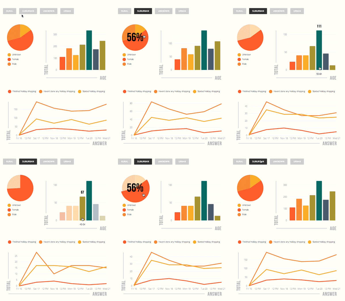
Users don’t need to be good at coding or math. By inputting live data into a Google Spreadsheet, the infographic will automatically update. Users can perform visual queries on complex datasets while audiences can dive into data and interactively explore information. Moreover, users can import up to 10,000 rows of data via a Google Spreadsheet or CSV; the company plans to support more import options and even larger datasets in the near future.
Chaisson’s team now stands at four people, three of which work at the Montreal office. Chaisson splits her time between Quebec and in, of all places, Columbia, Missouri. That’s because she landed a fellowship at the Reynolds Journalism Institute (RJI), a prestigious department of the University of Missouri that engages media professionals, scholars and other citizens in programs aimed at strengthening journalism in the service of democracy. The post comes with a healthy $90,000 grant, and Chaisson couldn’t be happier to do what she loves, armed with a plethora of great resources.
Her work at RJI involves conducting research on small news rooms and how they use data visualizations and specifically in the context of data exploration, when they’re creating interactive data visualizations to help readers explore complex data sets. “We’re going to be studying what tools they currently use, what skill sets people have who are creating these visualizations, and if the skill sets are matched to the tools,” said Chaisson. “We’re also going to be doing some work on the output on those visualizations and weather or not the readers are engaging with them, so we’ll test a few different variables like share rates, time on page, perceived asthetic quality and whether or not it influences the readers perception of the media outlet.”
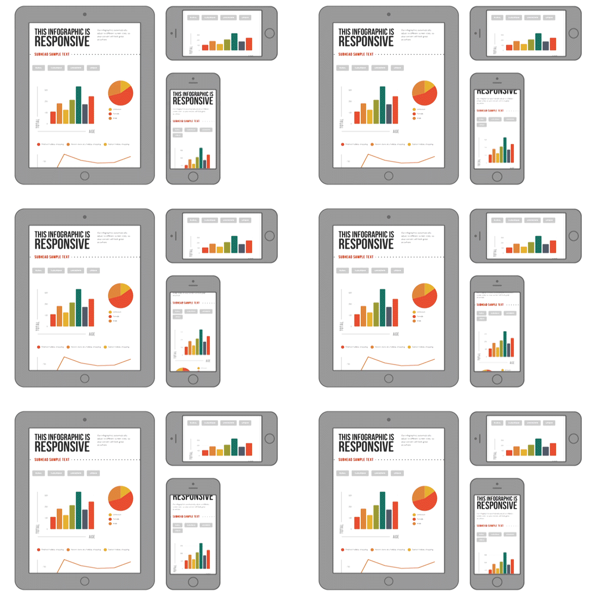
Finally, she’ll take a look at mobile optimization: what does it what look like to do exploratory data visualizations on mobile devices?
The CEO was referred the the RJI post through a colleague and said that “their interests were really in line with our interests: we started talking and we just took it from there and it turned out to be a really great oppottunity for us.”
While Chaisson hops back and forth from Montreal to Columbia, she’ll be keeping a close eye on the Kickstarter page. After a few hours $1,500 has already been raised.


